
Re-Imagining the Journey for Protection Pathways
Re-Imagining the Journey for Protection Pathways
PROTECTION PATHWAY
Sept 2022 - November 2022
3 PERSON TEAM - PRODUCT MANAGER, RESEARCHER, SME AND MYSELF
MY ROLE - UX/UI DESINGER
ABOUT PROJECT
Protection Pathways is a financial planning tool for advisers to compare and recommend life, income, and critical illness cover with ease and regulatory confidence. Integrated with Webline, it streamlines multi-benefit quoting and application workflows.
I supported the product end-to-end—gathering insights, mapping adviser journeys, designing wireframes, and refining usability through testing and iterative collaboration with developers.
CHALLENGE
The current digital process faced several key challenges that impacted efficiency and user satisfaction. One major issue was the presence of void results, leaving advisers without viable outcomes and adding unnecessary steps. Commission handling was entirely manual, increasing the risk of errors and consuming valuable time. Error management lacked clarity, making it difficult for users to understand and correct mistakes quickly. Finding the best quote required sifting through results one by one, often leading to the creation of four to five quotes just to land on the right option. Additionally, the critical illness comparison table was inconvenient and inefficient, making it harder for advisers to confidently assess and present suitable choices to clients.
PROBLEM STATEMENT
After understanding the challenge I went away and listed all the problem statement to help me design solution effectively.
-
How to create an experience for the adviser to create quotes from an hour to minutes.
-
How to allow the adviser to suggest the best quote matches their budget and expectation?
-
How to create an interface where the adviser can have control of what they want to do?
-
How to increase engagement between advisors and software
BUSINESS REQUIRMENT
-
To increase engagement and the licencing of the product
-
Rebrand and redesig the existing product for implementation on the Salesforce platform
-
Be able to complete the project before rebranding of the company
There were also some business requirment I needed to meet which fundamentally impacted the user flow and the product it self.
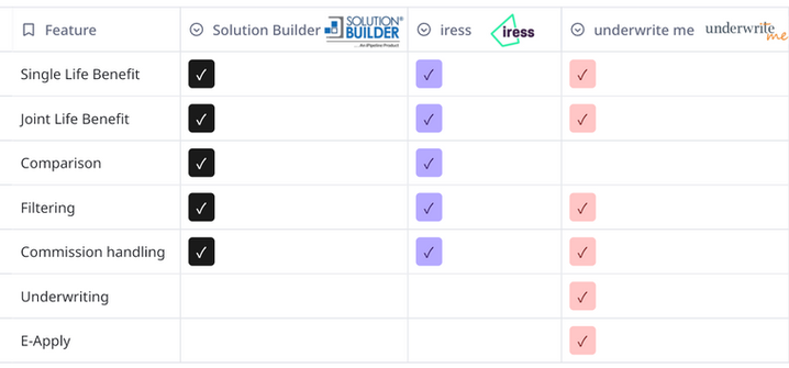
COMPETITOR ANALYSIS
Before diving into redesigning the experience or exploring user needs, it was equally important to benchmark competitors, understand their market position, and assess their design approaches. I conducted a detailed analysis of platforms such as iPipeline, Iress, Direct Life, and UnderwriteMe, using the data to identify common patterns, gaps, and differentiators that could inform a more strategic and user-aligned solution.
USER RESEARCH
Following alignment with the business objectives, the focus shifted to understanding the end users—specifically advisers using Synaptic’s Webline software and those relying on alternative platforms. To gather meaningful insights into their experiences, workflows, and pain points, interviews were conducted with six financial advisers, covering a mix of tool usage and digital behaviours.
Existing research data provided a strong foundation for this project by offering a baseline understanding of user needs, pain points, and behavioural patterns. This included previous usability studies and adviser feedback. These insights helped identify recurring issues such as navigation friction, unclear error messaging, and the need for streamlined workflows.
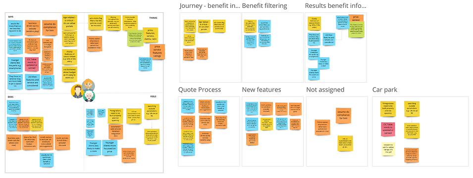
EMPATHY MAP & AFFINITY MAPPING
To synthesise this information, data from interviews, observations, and stakeholder inputs were organised into an affinity map. This method allowed for grouping similar themes—such as advisers’ need for autonomy, trust in system feedback, and desire for efficiency—into clusters. These clusters informed key design priorities, ensuring decisions were grounded in user behaviour rather than assumptions. The affinity map ultimately served as a strategic reference to align cross-functional teams around users' real-world challenges.
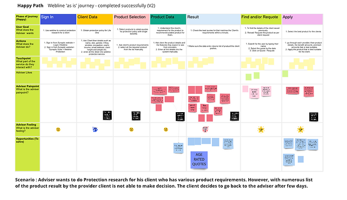
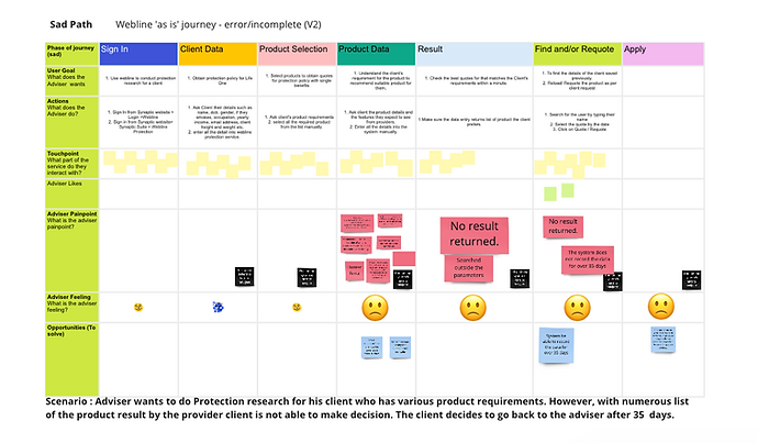
USER JOURNEY MAPPING
The third step after user research was to draw user journey for a record to understand the user goal, actions, touchpoint, painpoint, their feelings and the opportunity to resolve any issue. The User Journey was divided into Happy and Sad path, Sad path gave us a good lead where the main point was situated.
ORGANISING PROBLEM
I developed a series of "How Might We" statements to frame the design challenges and uncover user-centered opportunities. These statements helped guide ideation by translating insights from user research into actionable problem areas, ensuring solutions remained aligned with both business goals and adviser needs.
-
HMW avoid void result?
-
HMW prevent user from unrealistic expectation?
-
HMW approach commission handling?
-
HMW customise the result to user's preferrence?
-
HMW allow the user to be confident about their selection of cover option?
-
HMW prevent manually confirmation of Critical Illness cover?
SOLUTION
After thoroughly analysing the issue using the existing data, it was essential to reflect on these findings to inform the proposed solution.
-
Messaging and Error handling.
-
Add option for the adviser to handle commission
-
Error Messaging and pop up.
-
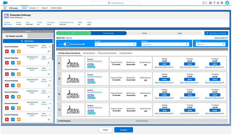
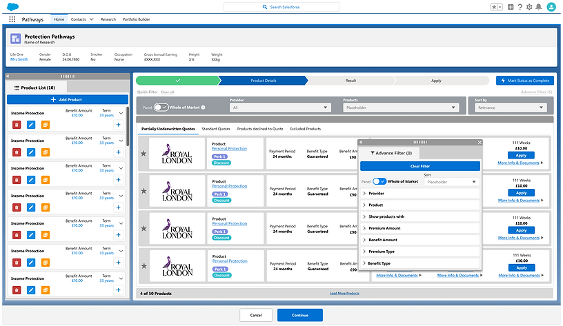
Advance Filter to narrow down the result.
-
Allow user to copy the benefit and change the detail as required without going through the whole process
USERFLOW
To address the design solution I create a user flow. These served as a bridge between user research insights and design exploration, helping shape ideas into practical problem areas that stayed aligned with both adviser expectations and the overall business objectives.

TIME CONSTRAINTS
Due to time constraints, I had to adjust the MVP scope by narrowing the focus to the most critical features that would deliver immediate value to users. This involved re-evaluating priorities, deferring non-essential functionalities, and ensuring that the core user journeys remained seamless and impactful within the limited timeline.
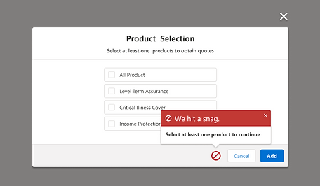
1. Could not get a result every time. > Solution (Error handling)
2. Unrealistic expectation. > Solution (Error handling)
3. Difficulties in commission handling. > Solution (Add option for the adviser to handle commission)
4. Be able to narrow the result.>Solution (Advance Filter)
5. Have to do 4-6 quotes before getting the best one.> Solution (Comparision tool)
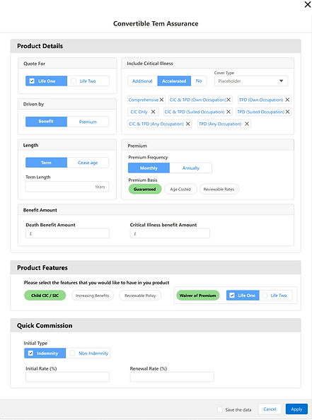
6. Critical Illness Cover table still in pdf format was in convenient and time-consuming to use > Solution (Designing the Critical Illness Cover table (a pdf) to a dynamic table)
FINAL USER FLOW
Based on the new HMW statement new user flow was create that had cut down version of the previous flow.
.png)
LIGHTING DESIGN SYSTEM
I applied the Salesforce Lightning Design System (SLDS) from the wireframing stage, ensuring early alignment with its components, layout rules, and accessibility standards. This foundation supported consistency, simplified developer handoff, and enhanced collaboration—enabling me to focus on solving user needs with interfaces that were both scalable and implementation-ready.
INITIAL SKETCH
Select Product:Error

View Result

Faceted Filter

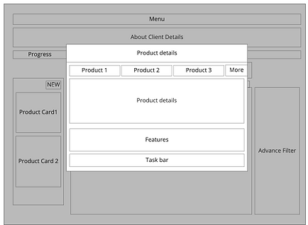
WIREFRAME
Building on the initial sketch, I collaborated closely with the Product Support Consultant and Product Manager to develop the following solution. Through joint discussions and iterative feedback, we aligned our ideas to ensure the design addressed both user needs and business goals.
.png)
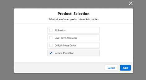
Select product
.png)
Filter/search product
.png)
View result
.png)
Select Product:Error
.png)
Filter/search product:Error
.png)
Faceted Filter
PROTOTYPE

USABLITY TEST
The first step to conduct was to prepare what needed to be asked in the usability test (The task). Hence, I created the following user journey that I expect the user to go through. With the help of the team we prepared total of 5 task, questionnaire (SUPR-Q) and follow up qualitative interview for a deeper insight of user’s experience and what they thought of the new design.
.png)
ITERATION
Following were the core findings from the user testing :
-
Users found the filtering feature distracting during their tasks.
-
While adjusting the advanced filter, they couldn’t view the results page simultaneously, disrupting their flow.
-
The drag-and-drop interaction between the advanced filter and product list wasn’t intuitive—users took time to grasp how it worked.
A key strength of the project was maintaining design consistency across the platform. This familiar structure allowed users to transfer knowledge from existing services, reducing cognitive effort when adapting to the new system.
Although drag-and-drop functionality was introduced to offer flexibility in using the product list and filters side-by-side, it ultimately caused confusion. Based on observation and user interviews, it became clear that supporting both elements in this way wasn’t essential and could be deprioritised.

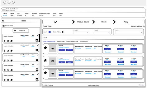
FINAL DESIGN
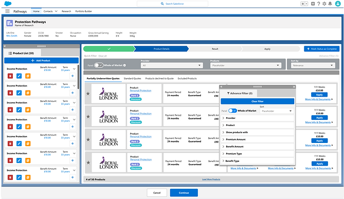
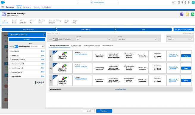
To enhance usability, I iterated the design by replacing the movable filter window with a fixed, static layout. User feedback and usability testing revealed that the draggable filter panel introduced unnecessary complexity and cognitive load, particularly for advisers unfamiliar with dynamic UI elements. By shifting to a static filter positioned consistently within the interface, users found it easier to focus, access filters quickly, and understand the relationship between filter settings and the results shown. This change improved task efficiency, reduced confusion, and contributed to a more streamlined and intuitive user experience.e
BEFORE
AFTER
DESIGN HANDOVER
I leveraged Figma’s Dev Mode to streamline the design handover process. All components and design tokens were organized using consistent naming and styles, enabling developers to inspect elements, view CSS snippets, and access specs like spacing, typography, and asset downloads directly. This reduced back-and-forth by providing devs with real-time, ready-to-implement details right within the design file.

QUALITY ASSURANCE TEST
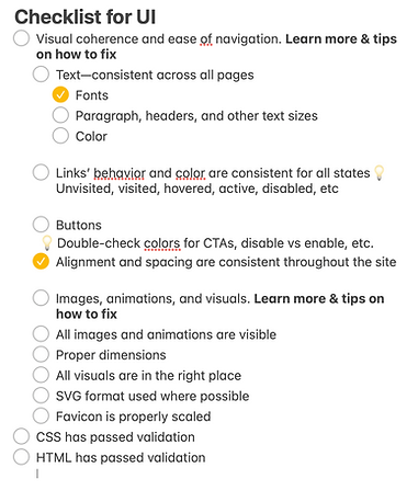
I created a detailed UI QA checklist to validate the developed product against the Figma designs, covering visual consistency, spacing, typography, responsive behavior, and interactive states. I systematically reviewed each item and ensured the implementation met all design specifications before sign-off.
CONCLUSION
The next step is to conduct usability testing on the fully functional product to evaluate how effectively advisers interact with the live system in realistic conditions. This involves preparing task-based scenarios, observing user behaviours, and collecting feedback to uncover friction points, validate user flows, and refine the interface. Testing in this context ensures the solution not only looks good on paper but also performs smoothly in practice.